A Guide To Working With The Colour Green
When it comes to working with the colour green, there are a few key do’s and don’ts when it comes to nailing this ever popular palette in the world of design.
While green was predicted to be on trend as early as 2010, it’s become less of a fad and more of a classic design look that is seemingly here to stay. With more and more homes presenting a variety of shades such as deep forest greens, earthy olives, decadent emeralds and even bright, retro renditions of lime, even when used in small doses, glorious greens will have a big impact and add punch and personality to any interior.
However, working with the colour green is something that still baffles many DIY enthusiasts. Although the old saying goes that blue and green should never be seen, even that’s gone out the window too – so how do you get it right?
Introducing Shades Of Green To Your Home
Rumour has it that the colour green has healing power to it, and is understood to be the most restful and relaxing colour for the human eye to view. Oddly enough, the science even says that green takes up more space in the spectrum visible to the human eye. Since it is the dominant colour in nature, it’s often viewed as the logical choice in interior design as an ideal background or backdrop – quite simply, we humans are so used to seeing it everywhere, and arguably crave it more than ever during an era in which our outdoor movements are so limited.
When it comes to working with the colour green, always remember to choose a palette with purpose. Consider the mood and atmosphere that you wish to create in a room, as not all shades of green may be well suited to your home. Decide on the combination, proportion, placement for all the colours being used, and be sure to remember that each tone of the colour has its own set of psychological properties which can change depending on what other colours you team with it. Once you’ve selected your hue of choice, the only real question left is how you’re going to unleash it.
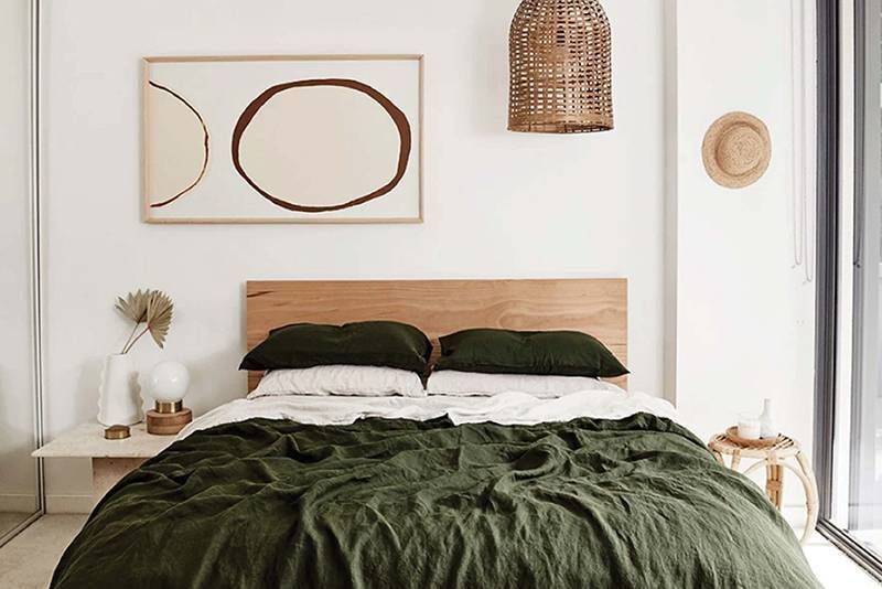
Statement Furniture – If you’re dabbling with the idea of working with the colour green but don’t quite want to commit to a permanent feature in your home, then consider adding a statement piece of furniture as an experiment. Whether it’s a deep emerald velvet armchair, a patterned rug, or even a new quilt cover, this offers a ‘try before you buy’ way to work with this palette.
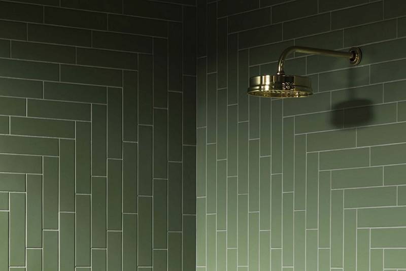
Coloured Tiles – Coloured green tiles provide a way to add this hue to your home without going overboard. Popular options include using green tiles as a kitchen splashback material such as forest green subway tiles, creating a statement in your bathroom with deeper shades, or even as herringbone or hexagon style flooring solutions.
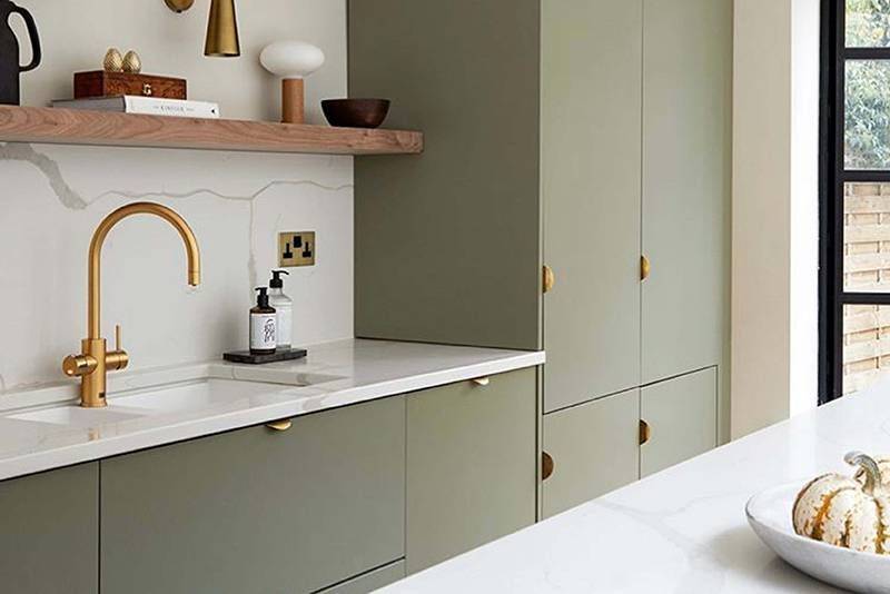
Experimental Cabinetry – Adding a shade of green to your kitchen cabinetry adds a level of sophistication to the heart of your home, and many people are surprised to see the results when combining the colour palette with other shades of white, grey, black and even natural materials such as wood and timber.
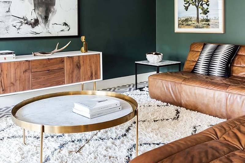
Feature Walls – If you’re feeling bold, painting the walls of your lounge or bedroom in a shade of green is one surefire way to invoke a sense of calmness and general serenity if you manage to get it right. If that’s not so much your style, consider opting for just one feature wall instead, or even trying your hand at removable wallpaper with a pattern as a Plan B.
Go Natural – Although many Australians are already doing this, we’re well and truly living in the era of the indoor plant. After all, our love affair with the colour green can arguably be traced back to our love of nature, so go wild and bring the outdoors in. If you have the time, energy and resources, consider creating a living green wall via a vertical garden or use climbing vines.
When it comes to working with the colour green, how much – or how little – you want to use is entirely up to you. This shade is also incredibly versatile, and works well with not only basic palettes commonly used such as whites and greys, but even ‘pops’ well with splashes of warmer colours such as reds, oranges and pinks. For a more subdued look, use green with timbers and more natural palettes.
Talk To The Experts About Sourcing Your Materials
While your options for tile finishes are almost limitless, selecting the right type of product for your home certainly isn’t an easy feat. With each space, comes a different preference or priority: are you chasing style, functionality, or simply want to stay within the budget?
In operation for over 25 years, at Tile Wizards we pride ourselves on getting you more – for less. We pioneered the warehouse format, and our stores are purposefully designed to make your selection easier, and ultimately offer our customers quality, price and the right advice. Even if you are just after some honest and friendly advice – please don’t hesitate to get in touch with us at Tile Wizards today for a free quote. We’re able to work with you in order to bring your dream flooring solution to life.