Pantone Colour Of The Year Explained
The 2022 Pantone “Colour Of The Year” has recently been announced, and interior designers and homeowners alike have been quick to embrace this year’s hue.
For the uninitiated, Pantone LLC is an American company best known for its Pantone Matching System, a proprietary colour space used in many industries, but most notably for interior design, graphics, fashion, printing and manufacturing. The system notably supports the overall management of colour from design to production in both physical and digital formats, and with a wide variety of materials such as cotton, polyester, nylon and plastics.
Essentially, the Pantone colour system originated in 1963 to solve the problem of complicated colour matching in the printing industry. It soon became the dominant go-to as the easiest and simplest way to classify, communicate and match colours with the use of a colour catalogue, with each tone and tint issued its own individual number.
In 2000, the Pantone Colour Institute created the “Pantone Colour Of The Year” as a trendsetting concept for branding, marketing and creative society as a whole. The initiative all but confirmed the Pantone Colour Institute as the front-runner for all things colour-related on a global scale, with thousands of industry experts anxiously waiting each year to see what the hue of choice will be for the next twelve months. In 2022, that hue has finally landed and has been dubbed “Very Peri”.
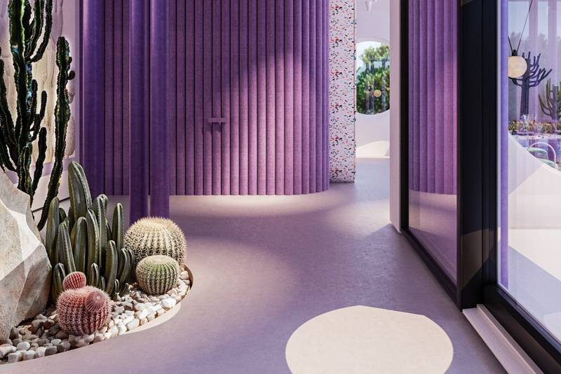
The Year Of Very Peri Is Here
In the past, Pantone has stated that colour has always been an integral part of how a culture expresses the attitudes and emotions of the times, and selecting a shade that perfectly balanced purple and blue is a big reflection of the year we’ve all endured. With the announcement of Very Peri receiving the title of “Pantone Colour Of The Year”, a statement released by the company indicates that it is seemingly all too aware of the difficulties the world has faced over the last twelve months, tinged with a speckle of hope and optimism.
“Displaying a carefree confidence and a daring curiosity that animates our creative spirit, inquisitive and intriguing PANTONE 17-3938 Very Peri helps us to embrace this altered landscape of possibilities, opening us up to a new vision as we rewrite our lives. Rekindling gratitude for some of the qualities that blue represents complemented by a new perspective that resonates today, PANTONE 17-3938 Very Peri places the future ahead in a new light.”
Taking its name from periwinkle blue, the gorgeous hue is a direct response to the period of transition and upheaval the world has been experiencing. It’s name is derived from the lesser periwinkle or myrtle herb which bears flowers of the same colour, and is said to symbolise serenity and calmness – and who wouldn’t want such a vibe in their abodes?
For homeowners looking to jump on the Pantone colour bandwagon this year, Dave from Tile Wizards recommends budding renovators to think outside of the box when it comes to harnessing the magic of such a shade.
“Pantone colours are heavily used in the shop fitting and design industry, but we’ve also seen a growing trend in everyday homeowners embracing their tones. Pastel shades in particular have been on the rise in the world of interior design over the last twelve months, but it doesn’t mean that you need to tile or paint an entire room in the shade of choice. Instead, consider statement pieces of furniture or softer touches like art, rugs and even lamps to inject colour into your home. If you’re nervous about experimenting with a particular hue, this is also a way to do so without making big commitments to the overall look and feel of your property.”
If you’re in the throes of planning a home renovation or are perhaps debating one, there usually comes a point where you need to start shopping for building materials. Whether it’s advice on the perfect type of tile that best suits your project or simply the best price, the good news is that a visit to your local Tile Wizards outlet provides all the answers and more.
Talk Tiles With The Professionals
While your options for carpet, timber and tiles are almost limitless, selecting the right type for your home certainly isn’t an easy feat. With each space, comes a different preference or priority: are you chasing style, functionality, or simply want to stay within the budget?
In operation for over 25 years, at Tile Wizards we pride ourselves on getting you more – for less. We pioneered the warehouse format, and our stores are purposefully designed to make your selection easier, and ultimately offer our customers quality, price and the right advice.
While we specialise in options for tiles, carpets, timber and a wide variety of hybrid flooring materials, our services have just expanded even more. For customers who reside locally in Bokarina, Springwood and Para Hills, Tile Wizards have now introduced a range of vanities and tapware products in store, making it easier than ever to start conquering DIY projects at home.
Even if you are just after some honest and friendly advice – please don’t hesitate to get in touch with us at Tile Wizards today for a free quote. We’re able to work with you in order to bring your dream flooring solution to life.